Mittelschrift DIN 1451

| details about the font | |
|---|---|
| Name | Mittelschrift DIN 1451 [wrong?] |
| Style | Regular [wrong?] |
| category | Serifenlose Linear-Antiqua [wrong?] |
| designer(s) | Ludwig Goller [wrong?] |
| foundry | Deutsche Industrienorm [wrong?] |
| date released | 1936 [wrong?] |
| details about the photo | |
| author | willi |
| date | January 24, 2012 – 10:51 |
| place | Blücherstraße 71, 44147 Dortmund, Deutschland |
more information about the font
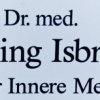
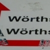
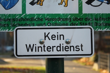
DIN stands for Deutsche Industrienorm, German Industrial Standard. In 1936 the German Standard Committee settled upon DIN 1451 as the standard font for the areas of technology, traffic, administration and business. The Committee chose a sans serif font because of its legibility and because its forms are also easy to write. This font was not foreseen for advertisements and other artistically oriented uses’ and there were disagreements about its aesthetic qualities. Nevertheless, this font was seen everywhere in Germany, on signs for towns and traffic, and hence made its way into advertisements because of its ease of recognition.
random photos with same
- category
- font
- designer
- foundry
- year
- category
- font
- designer
- foundry
- year