Corpid
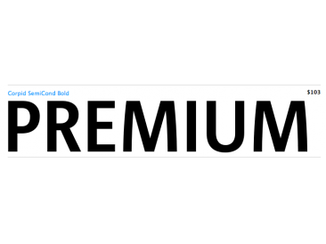
| details about the font | |
|---|---|
| Name | Corpid [wrong?] |
| Style | Condensed [wrong?] |
| category | Serifenlose Linear-Antiqua [wrong?] |
| designer(s) | Lucas de Groot [wrong?] |
| foundry | myfonts [wrong?] |
| date released | 1997 [wrong?] |
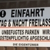
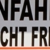
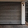
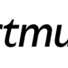
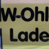
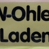
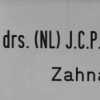
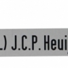
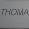
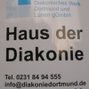
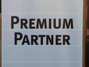
| details about the photo | |
| author | Ndru1987 |
| date | January 18, 2012 – 20:27 |
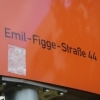
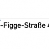
| place | Kapitelwiese 5, 44263 Dortmund, Deutschland |
more information about the font
The name Corpid derives from “Corporate Identity” - which is what this family of lowcontrast
sans-serifs was made for. Corpid was originally commissioned by Studio Dumbar in the Netherlands
as a corporate typeface for the Dutch Ministry of Agriculture, Nature Management and Fishing. The font
was designed to replace the existing standard typeface (a well-known business-like sans-serif) to provide the
organization with a unique and strong identity.
Although it was designed to fit strict technical requirements, Corpid has a personality all of its own. This was
in part a result of what Luc(as) calls “creating tension” between the inner and outer curves of each character.
„I tend to put a little more diagonal contrast into fonts than is the case in most neutral sans serif fonts. This
brings a certain humanistic touch to the typeface. Much more subtle here than in Thesis - but although it is
almost invisible, it is still palpable.“
Corpid was gradually expanded into a five-weight, three-width family. The new Corpid SemiCondensed has
double functionality. It is a no-frills, compact headline font that offers optimum legibility in sizes from small
to huge. It is also a great space-saving text typeface for magazines, newsletters or annual reports: economic,
versatile, and provided with several different numeral sets. In this OpenType type version, all weights come
with Small Caps. With its wealth of numeral styles and complete character sets (including Central European)
the Corpid family is now well equipped to tackle the most complex of typographic tasks.
random photos with same
- category
- font
- designer
- foundry
- year
- category
- font
- designer
- foundry
- year