ITC Motter Corpus
| details about the font | |
|---|---|
| Name | ITC Motter Corpus [wrong?] |
| Style | Condensed [wrong?] |
| category | Serifenlose Linear-Antiqua [wrong?] |
| designer(s) | Othmar Motter [wrong?] |
| foundry | ITC [wrong?] |
| date released | 1993 [wrong?] |
| details about the photo | |
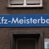
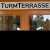
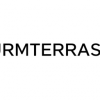
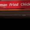
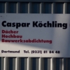
| author | cndrk |
| date | January 25, 2012 – 00:52 |
| place | Oesterholzstraße 51, 44145 Dortmund, Deutschland |
more information about the font
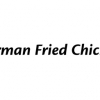
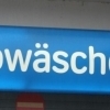
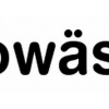
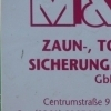
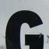
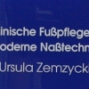
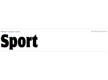
ITC Motter Corpus was designed by the Austrian type designer Othmar Motter in 1993 to combine the display
advantages of a sans serif extra bold design with the legibility of a roman weight. The Motter Corpus is available in the weights
regular and condensed regular. The capitals with their strong strokes display slight irregularities and natural looking outlines.
When used in very large point sizes the tiny serifs become noticeable. Distinguishing characteristics of this typeface are the
unusual design of the g with its upward reaching ear and that of the capital C, whose curve ends in an angular stroke in its
upper third. Almost, but not quite, a sans serif, the typeface has diminutive serifs which, along with its modulated weight contrasts,
make ITC Motter Corpus remarkable legible in display applications and will give text a nostalgic feel. A similar typeface
is Linotype Bariton.
random photos with same
- category
- font
- designer
- foundry
- year
- category
- font
- designer
- foundry
- year