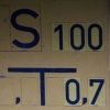
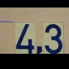
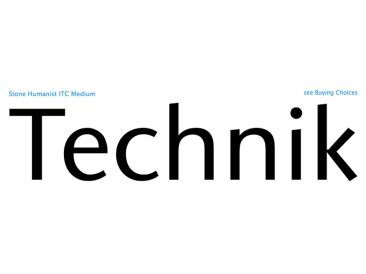
Stone Humanist ITC
| details about the font | |
|---|---|
| Name | Stone Humanist ITC [wrong?] |
| Style | Medium [wrong?] |
| category | Serifenlose Linear-Antiqua [wrong?] |
| designer(s) | Summer Stone [wrong?] |
| foundry | ITC [wrong?] |
| date released | 2005 [wrong?] |
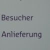
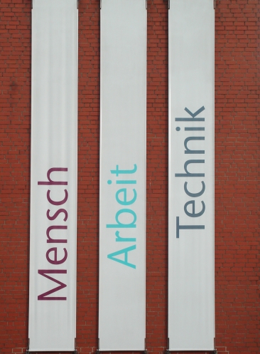
| details about the photo | |
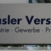
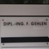
| author | bumbini |
| date | January 22, 2012 – 15:17 |
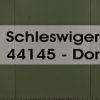
| place | Friedrich-Henkel-Weg 18A, 44149 Dortmund, Deutschland |
more information about the font
Type designers have been integrating the design of sans serifs with serifed forms since the 1920s. Early examples are Edward Johnston's design for the London Underground, and Eric Gill's Gill Sans. These were followed by Jan van Krimpen's Romulus Sans, Frederic Goudy's ITC Goudy Sans, Hermann Zapf's Optima, Hans Meier's Syntax and Adrian Frutiger's Frutiger.
Now, ITC Stone Humanist joins this tradition. It is a careful blend of traditional sans serif shapes and classical serifed letterforms.
ITC Stone Humanist grew out an experiment with the medium weight of ITC Stone Sans, a design that already showed a relationship to these sans serif-serif hybrids. ITC Stone Sans has proportions based on those of ITC Stone Serif, and its thick-and-thin stroke contrast suggests the bloodline of humanistic sans serif typefaces. But other aspects of ITC Stone Sans are more closely aligned to the gothics and grotesques, a tradition that accounts for the largest portion of sans serif designs.
Enter ITC Stone Humanist. During his experiments with the earlier design, Sumner Stone recalls, "I was actually quite surprised at how seemingly subtle changes transformed the face," moving the design firmly into the humanist tradition. "The form of the 'g,' 'l,' 'M,' 'W,' and more subtly the 'a' and 'e' are part of the restructuring of the family," he explains. The top endings of vertical lower case strokes have been cropped on an angle, as have the ascender and descender stroke endings.
ITC Stone Humanist is a full-fledged member of the ITC Stone family. It has been produced with the same complement of weights, and the x-heights, proportions, and underlying character shapes are completely compatible with the three original designs.
The original ITC Stone Sans is a popular typeface, in part because of its notable versatility. ITC Stone Humanist shares this virtue, and can be used successfully at very small sizes, in long passages of text copy, and even as billboard-sized display type.
Quelle: www.linotype.com
random photos with same
- category
- font
- designer
- foundry
- year
- category
- font
- designer
- foundry
- year