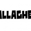
worldwide

| details about the font | |
|---|---|
| Name | worldwide [wrong?] |
| Style | Regular [wrong?] |
| category | Fremde Schriften [wrong?] |
| designer(s) | Nick Shinn [wrong?] |
| foundry | ShinnType [wrong?] |
| date released | 1999 [wrong?] |
| details about the photo | |
| author | Rattata |
| date | January 30, 2012 – 16:52 |
| place | allensteiner straße 47, 44137 Dortmund, Deutschland |
more information about the font
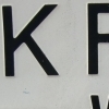
Worldwide is a typeface in the Century idiom, designed with present day newspaper usage in mind. That’s to say, it’s somewhat condensed, and combines strong, traditional form with subtle finish.
The characters follow the Century genre closely, although there is more variety in the width of the caps: a narrowing of the E and a widening of the M, for instance, which gives a more even colour and less distortion.
There are no straight lines in the construction of Worldwide. The vertical strokes are subtly cinched in the middle, and the outside serif corners are lightly barbed. Acute joints between strokes are hollowed out with “ink traps”. These devices counteract the softening of the typographic image that occurs with press gain, and the clogged-up, dirty impression which that can cause.
The same detailing which works imperceptibly to create clarity at text size provides visual interest in the headline fonts. These are also a touch more condensed, and a tad lighter, than their text counterparts.
random photos with same
- category
- font
- designer
- foundry
- year
- category
- font
- designer
- foundry
- year