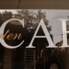
sparkasse
| details about the font | |
|---|---|
| Name | sparkasse [wrong?] |
| Style | Regular [wrong?] |
| category | Fremde Schriften [wrong?] |
| designer(s) | Unbekannt [wrong?] |
| foundry | Dalton Maag [wrong?] |
| date released | Field not set [wrong?] |
| details about the photo | |
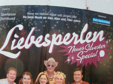
| author | Rattata |
| date | January 30, 2012 – 16:47 |
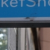
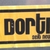
| place | allensteiner straße 47, 44137 Dortmund, Deutschland |
more information about the font
The business model of the Sparkasse bank in Germany is unique; its regional divisions, called institutions, are independent businesses although they all operate under the name of Sparkasse. There are over 500 institutions within this group combining around 17,000 branches across Germany. The independent nature of the institutions allows for banking services and products that are tailored to the needs of their clientele, even at branch level, rather than a one-size-fits-all banking model. Unfortunately, this had also led to independent decision making regarding the implementation of Sparkasse’s brand and visual identity.
In 2001 we were approached by Interbrand Cologne to design a font family to help underpin the unification of the Sparkasse identity across all the institutions. Only the existing Sparkasse ‘S’, designed by Otl Aicher, was used consistently, although with different colours and in conjunction with fonts ranging from Times to Helvetica, via Rotis. Using the ‘S’ as a basis, Interbrand suggested that all institutions should use the logo in same colour (red on a white background) alongside our new Sparkasse font.
In an initial design study we developed several different font styles with the aim of capturing the desired typographic expression. The chosen design was a humanist sans serif that embraced the values of warm, inviting and friendly, while also maintaining seriousness and authority. The resulting font family was to consist of Light, Regular, and Bold, plus their Italics. The Regular and Bold styles were for general purpose usage, ranging from office applications to billboards, whilst the Light styles were primarily for external communications such as advertisements. Accordingly, the core set of fonts for use within an office environment are fully-hinted for high-quality screen display.
The initial font suite proved so successful that Sparkasse asked for the font family be expanded with an Extrabold and a matching set of Serif fonts to complement the font family. The Serif fonts were primarily intended to be used within the publishing arm of Sparkasse that produces in-house newsletters and educational material, as well as customer magazines and information pamphlets.
Today, most Sparkasse institutions have fully applied the new visual identity, with others in the process of rolling it out. With an organization of this size and complexity, this process takes many years, often being intentionally aligned with a major software upgrade. Throughout the installation of the fonts the Dalton Maag support team has assisted Sparkasse with a smooth migration, and continues to do so. The client reported increased business in some institutions after applying the new visual identity. We are particularly proud to know that the font suite was well received by their customers, who commented that the fonts are easy to read, and convey a feeling of trustworthiness.
random photos with same
- category
- font
- designer
- foundry
- category
- font
- designer
- foundry