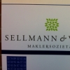
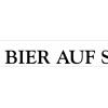
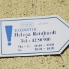
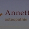
Goudy
| details about the font | |
|---|---|
| Name | Goudy [wrong?] |
| Style | Bold [wrong?] |
| category | Französische Renaissance-Antiqua [wrong?] |
| designer(s) | Frederic William Goudy [wrong?] |
| foundry | Linotype, Design owner: Monotype Imaging [wrong?] |
| date released | 1916 [wrong?] |
| details about the photo | |
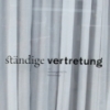
| author | bumbini |
| date | January 15, 2012 – 07:31 |
| place | Technische Universität Dortmund, Campus Nord, Vogelpothsweg 76 |
more information about the font
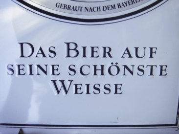
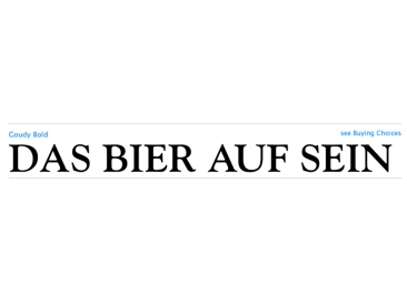
Over the course of 50 years, the charismatic and enterprising Frederic W. Goudy designed more than 100 typefaces; he was the American master of type design in the first half of the twentieth century. Goudy Old Style, designed for American Type Founders in 1915-1916, is the best known of his designs, and forms the basis for a large family of variants. Goudy said he was initially inspired by the cap lettering on a Renaissance painting, but most of the flavor of this design reflects Goudy's own individualistic style. Recognizable Goudy-isms include the upward pointing ear of the g, the diamond-shaped dots over the i and j, and the roundish upward swelling of the horizontal strokes at the base of the E and L. The italic was completed by Goudy in 1918, and is notable for its minimal slope. Goudy Bold (1916-1919) and Goudy Extra Bold (1927) were drawn not by Goudy, but by Morris Fuller Benton, who was ATF's skillful in-house designer. Goudy Catalogue was drawn by Benton in 1919-1921 and was meant to be a medium weight of Goudy Old Style. Goudy Heavyface was designed by Goudy for Monotype in 1925, and was intended to be a rival to the successful Cooper Black. Goudy Modern was designed by Goudy in 1918; its small x-height, tall ascenders and shorter caps impart a spacious and elegant feeling. Benton designed Goudy Handtooled, the shaded version that has just a hairline of white through its bold strokes. The Goudy faces, especially the bolder weights, have long been popular for display and advertising design. They continue to pop up all over the world, and still look reassuring to our modern eyes.
Quelle: www.linotype.com
random photos with same
- category
- font
- designer
- foundry
- year
- category
- font
- designer
- foundry
- year