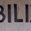
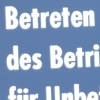
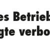
Tahoma

| details about the font | |
|---|---|
| Name | Tahoma [wrong?] |
| Style | Bold [wrong?] |
| category | Serifenlose Linear-Antiqua [wrong?] |
| designer(s) | Matthew, Tom Carter, Rickner [wrong?] |
| foundry | Ascender Corp. [wrong?] |
| date released | 1995 [wrong?] |
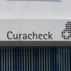
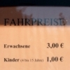
| details about the photo | |
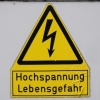
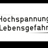
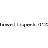
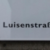
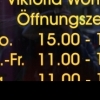
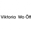
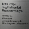
| author | Ndru1987 |
| date | January 18, 2012 – 20:02 |
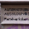
| place | Märkische Straße 227, 44141 Dortmund, Deutschland |
more information about the font
Myfonts:
Tahoma is one of Microsoftís new sans serif typeface families. It consists of two Windows TrueType fonts (regular and bold), and was created to address the challenges of on-screen display, particularly at small sizes in dialog boxes and menus.
Since the Tahomas are TrueType fonts, they can be rotated and scaled to any size, and anti-aliased by the rasterizer built into Microsoft Windows 95 and Microsoft Windows NT 4.0. These features give the fonts significant advantages over bitmap system fonts such as MS Sans Serif.
The Latin, Greek and Cyrillic characters were designed by world renowned type designer Matthew Carter, and hand-instructed by leading hinting expert, Tom Rickner. The Arabic, Hebrew and Thai characters were designed to complement Carterís initial designs. Tahoma sets new standards in system font design. It is ideal for use in User Interface Scenarios and other situations requiring the presentation of information on the screen.
Tahoma Small Caps Font is one of Microsoftís most popular sans serif typeface families. Tahoma was designed to address the challenges of on-screen display, particularly at small sizes in dialog boxes and menus.
Tahoma Small Caps Font (is best for use in User Interface Scenarios and other situations requiring the presentation of information on the screen. Contains 2 fonts: Regular and Bold. Why a Small Caps font you may ask? While most word processing and page layout software offer a small cap feature - this merely distorts the letterforms and creates compressed, uneven results.
Tahoma Small Caps were designed so their weight matches the upper case letters, providing a clean, eye-catching appearance.
Wiki:
Die Tahoma ist eine serifenlose Linear-Antiqua-Schrift, die 1995 von Matthew Carter f¸r Microsoft entworfen wurde. Sie ‰hnelt Carters gleichfalls f¸r die Darstellung auf dem Bildschirm entwickelter Verdana, hat aber einen geringeren Buchstabenabstand. Im Unterschied zur Verdana verf¸gt sie nicht ¸ber kursive Schriftschnitte. Daf¸r wurde der Umfang der Unicode-Unterst¸tzung vergrˆflert: w‰hrend die Verdana nur lateinische, griechische und kyrillische Zeichen beinhaltet, unterst¸tzt Tahoma zus‰tzlich Arabisch, Hebr‰isch und Thail‰ndisch.
Tahoma wurde in Microsoft Windows Vista durch die Schriftart Segoe UI abgelˆst. Laut Microsoft kann man die in Segoe UI verfassten Texte bis zu f¸nf Prozent schneller lesen.
Diese Schrift hat einen Gestaltungsfehler: Das im Deutschen und vielen anderen europ‰ischen Sprachen verwendete Anf¸hrungszeichen oben ñ Unicode U+201C (ì) ñ ist nach links statt nach rechts geneigt. Dies stˆrt den Lesefluss und f¸hrt zu einem stilistisch unschˆnen Schriftbild.
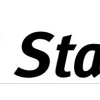
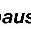
random photos with same
- category
- font
- designer
- foundry
- year
- category
- font
- designer
- foundry
- year