Manhattan ITC
| details about the font | |
|---|---|
| Name | Manhattan ITC [wrong?] |
| Style | Regular [wrong?] |
| category | Serifenlose Linear-Antiqua [wrong?] |
| designer(s) | Tom Carnase [wrong?] |
| foundry | Linotype Design Studio [wrong?] |
| date released | 1970 [wrong?] |
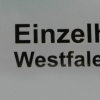
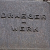
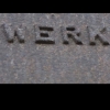
| details about the photo | |
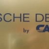
| author | HKS |
| date | January 18, 2012 – 18:10 |
| place | Hohe Straße 6, 44137 Dortmund, Deutschland |
more information about the font
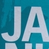
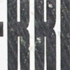
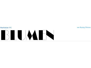
Manhattan was designed in 1970 for ITC by Tom Carnase, who also created Avant Garde Gothic. The distinguishing characteristic of this designer's work is found in the emphasis on the thick-thin constrast. In this case, Carnase approached the border of the impossible. The heavy vertical strokes stand opposite the finest of lines and the thick columns dominate the overall look. The basic forms are strictly constructed, as are those of Morris F. Benton's Broadway of 1925, to which many parallels can be found. Manhattan is best used for applications which will not be placed too far from the viewer, as at too great a distance the fine lines can no longer be seen. It should be used exclusively for headlines in medium point sizes.
random photos with same
- category
- font
- designer
- foundry
- year
- category
- font
- designer
- foundry
- year