Bodoni


| details about the font | |
|---|---|
| Name | Bodoni [wrong?] |
| Style | Regular [wrong?] |
| category | Klassizistische Antiqua [wrong?] |
| designer(s) | Morris Fuller Benton [wrong?] |
| foundry | Bitstream [wrong?] |
| date released | Field not set [wrong?] |
| details about the photo | |
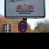
| author | Sascha K |
| date | January 17, 2012 – 19:10 |
| place | kaiserstraße 67, 44137 Dortmund, Deutschland |
more information about the font
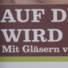
Bodoni ist die Bezeichnung für eine Reihe von klassizistischen Antiquaschriftarten, die auf den Italiener Giambattista Bodoni zurückgehen. Sie gehört neben den Schriften von Didot und Walbaum zu den bekanntesten Schrifttypen des Klassizismus. Der Kontrast zwischen Grund- und Haarstrichen ist hier besonders groß. Der Eindruck wird teilweise als geradezu geometrisch beschrieben.
Inspiriert wurde Bodoni vor allem durch die Arbeiten John Baskervilles. Zudem studierte er sehr genau die Schriften seiner französischen Konkurrenten Pierre Simon Fournier und Firmin Didot, wenngleich er einen eigenen Stil fand.
Digitale Versionen dieser Schriftart leiden – wie viele klassizistische Antiquaschriften – oftmals darunter, dass in kleineren Schriftgrößen die Serifen und Haarstriche zu dünn werden als dass man sie lesen könnte. Gleichzeitig werden die Grundstriche in großen Schriftgrößen sehr fett, weshalb bessere Digitalisierungen häufig verschieden stark kontrastierte Schriftschnitte für unterschiedliche Größen haben, oft mit dem englischen Begriff „optical sizes“ bezeichnet.
Giambattista Bodoni (1740-1813) was called the King of Printers; he was a prolific type designer, a masterful engraver of punches and the most widely admired printer of his time. His books and typefaces were created during the 45 years he was the director of the fine press and publishing house of the Duke of Parma in Italy. He produced the best of what are known as "modern" style types, basing them on the finest writing of his time. Modern types represented the ultimate typographic development of the late eighteenth and early nineteenth centuries. They have characteristics quite different from the types that preceded them; such as extreme vertical stress, fine hairlines contrasted by bold main strokes, and very subtle, almost non-existent bracketing of sharply defined hairline serifs. Bodoni saw this style as beautiful and harmonious-the natural result of writing done with a well-cut pen, and the look was fashionable and admired. Other punchcutters, such as the Didot family (1689-1853) in France, and J. E. Walbaum (1768-1839) in Germany made their own versions of the modern faces. Even though some nineteenth century critics turned up their noses and called such types shattering and chilly, today the Bodoni moderns are seen in much the same light as they were in his own time. When used with care, the Bodoni types are both romantic and elegant, with a presence that adds tasteful sparkle to headlines and advertising.
This version of Bodoni was done by Morris Fuller Benton for American Typefounders between 1907 and 1911. Although some of the finer details of the original Bodoni types are missing, this family has the high contrast and vertical stress typical of modern types. It works well for headlines, logos, advertising, and text.
random photos with same
- category
- font
- designer
- foundry
- category
- font
- designer
- foundry