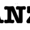
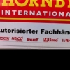
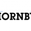
Neo Contact
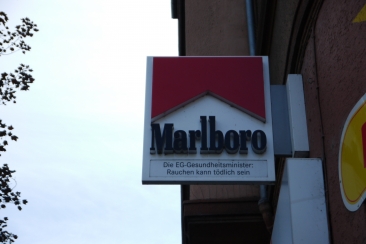

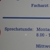
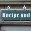
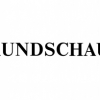
| details about the font | |
|---|---|
| Name | Neo Contact [wrong?] |
| Style | Regular [wrong?] |
| category | Serifenbetonte Linear-Antiqua [wrong?] |
| designer(s) | American Type Founders [wrong?] |
| foundry | Linotype Design Studio [wrong?] |
| date released | 1955 [wrong?] |
| details about the photo | |
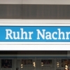
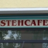
| author | Julchen |
| date | January 16, 2012 – 15:05 |
| place | Winterfeldstr. 1, 44141 Dortmund, Deutschland |
more information about the font
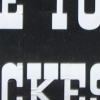
Neo Contact is the typeface used on the packaging of Marlboro cigarettes (Marlboro "Reds," the main line of the brand). The typeface is bold and condensed, designed in the Egyptienne style. Egyptienne types were first designed in the 1800s, as type founders - especially in the westward-expanding United States - began to dream up newer, bolder styles of letters for advertising usage. During the 1800s, it became increasingly important for businesses to set themselves, and their products, apart from competitors. This desire has remained with corporations, as well as with advertisers and designers, into the 21st century.
In addition to cigarette packaging, Neo Contact (as part of Marlboro's branding efforts) can be seen on numerous items, including Ferrari's F1 racers, and at Formula 1 race tracks.
The letters in Neo Contact are filled with personality. Their forms display two distinct weights of line, and the serifs are made up of tiny, strict slabs. Ball terminals round out the design. Neo Contact is a complete font, with a complete western character set.
Typefaces in the Egyptienne style proceeded the development and distribution of larger, crazier wood typefaces, but also share many similarities with these descendents. More traditional, text faces in the Egyptienne manner are also available from Linotype GmbH (e.g., Adrian Frutiger's Egyptienne F). On the opposite end of the spectrum, we offer interesting, personality-filled wood display types, like Ponderosa as well.
random photos with same
- category
- font
- designer
- foundry
- year
- category
- font
- designer
- foundry
- year


