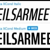
DIN 1451
| details about the font | |
|---|---|
| Name | DIN 1451 [wrong?] |
| Style | Engschrift [wrong?] |
| category | Serifenlose Linear-Antiqua [wrong?] |
| designer(s) | Robin Nicholas, Patricia Saunders [wrong?] |
| foundry | Linotype Design Studio [wrong?] |
| date released | 1936 [wrong?] |
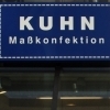
| details about the photo | |
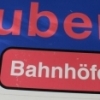
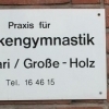
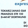
| author | snow601 |
| date | January 28, 2012 – 03:53 |
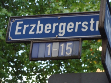
| place | Erzbergerstraße 1-15, 44137 Dortmund, Deutschland |
more information about the font
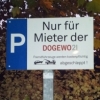
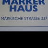
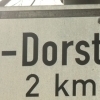
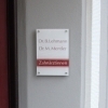
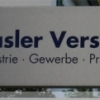
DIN stands for Deutsche Industrienorm, German Industrial Standard. In 1936 the German Standard Committee settled upon DIN 1451 as the standard font for the areas of technology, traffic, administration and business. The Committee chose a sans serif font because of its legibility and because its forms are also easy to write. This font was not foreseen for advertisements and other artistically oriented uses’ and there were disagreements about its aesthetic qualities. Nevertheless, this font was seen everywhere in Germany, on signs for towns and traffic, and hence made its way into advertisements because of its ease of recognition.
he abbreviation "DIN" stands for Deutsches Institut für Normung (The German Institute for Industrial Standards). In 1936 the German Standard Committee settled upon DIN 1451 as the standard font for the areas of technology, traffic, administration and business. The Committee chose a sans serif font because it was thought to be legible, straightforward, and easy to reproduce. They did not expect the font would be used for advertisements and other "artistically oriented" purposes. Nevertheless, because DIN 1451 has been seen all over Germany on signs for town names and traffic directions, this font became familiar enough to make its way to the palettes of graphic designers and advertising art directors. Despite disagreement about its aesthetic qualities, the contemporary digital version of DIN 1451 has been adopted and used by designers in other countries as well, solidifying its worldwide design reputation. Try it out for signage, magazine layouts, book covers, or flyers. DIN 1451's industrial heritage makes it surprisingly functional in just about any application.
Back in 1936 the German Standards committee Deutsches Institut Normung (DIN) proposed DIN 1451 as the standard type of lettering for road signage. As the original manual states ‘the purpose of this standard is to lay down a style of lettering which is timeless and easily legible’.
The DIN Text series was based on the original standards but was completely redesigned to fit typographic requirements and includes condensed and compressed versions.
Completed in 2002, it was first released and published in Parachute’s award-winning 2003 catalog and was an instant hit
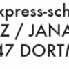
random photos with same
- category
- font
- designer
- foundry
- year
- category
- font
- designer
- foundry
- year