Avenir

| details about the font | |
|---|---|
| Name | Avenir [wrong?] |
| Style | Regular [wrong?] |
| category | Serifenlose Linear-Antiqua [wrong?] |
| designer(s) | Adrian Frutiger [wrong?] |
| foundry | Linotype Design Studio [wrong?] |
| date released | 1988 [wrong?] |
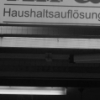
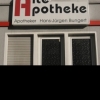
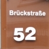
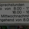
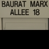
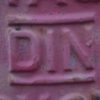
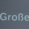
| details about the photo | |
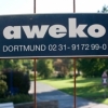
| author | Yvonne |
| date | January 20, 2012 – 11:20 |
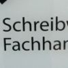
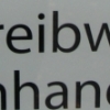
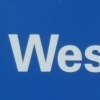
| place | Westenhellweg 52, 44137 Dortmund, Deutschland |
more information about the font
Adrian Frutiger designed Avenir in 1988, after years of having an interest in sans serif typefaces. In an interview with Linotype, he said he felt an obligation to design a linear sans in the tradition of Erbar and Futura, but to also make use of the experience and stylistic developments of the twentieth century.
The word Avenir means “future” in French and hints that the typeface owes some of its interpretation to Futura. But unlike Futura , Avenir is not purely geometric; it has vertical strokes that are thicker than the horizontals, an “o” that is not a perfect circle, and shortened ascenders. These nuances aid in legibility and give Avenir a harmonious and sensible appearance for both texts and headlines.
Adrian Frutiger designed Avenir™ in 1988, after years of having an interest in sans serif typefaces. In an interview with Linotype, he said he felt an obligation to design a linear sans in the tradition of Erbar and Futura, but to also make use of the experience and stylistic developments of the twentieth century. The word Avenir means 'future' in French and hints that the typeface owes some of its interpretation to Futura. But unlike Futura, Avenir is not purely geometric; it has vertical strokes that are thicker than the horizontals, an "o" that is not a perfect circle, and shortened ascenders. These nuances aid in legibility and give Avenir a harmonious and sensible appearance for both texts and headlines. In 2004 Adrian Frutiger and the type director of Linotype GmbH Akira Kobayashi reworked the Avenir and created the Avenir Next for the Platinum Collection.
Avenir ist der Name einer Schriftart, die von Adrian Frutiger erstmals 1988 der Öffentlichkeit vorgestellt wurde.
Der Name Avenir (franz. avenir „Zukunft“) ist eine Anspielung auf den Namen der Schriftart Futura (lat. futura „Zukunft“). Dahinter steht der Gedanke, dass die durch die Futura inspirierte Avenir eine etwas menschlichere und gefälligere, da nicht so vollständig geometrisch konstruierte Futura sein sollte.
Geschichte:
Bei ihrer Erstveröffentlichung umfasste die Avenir-Schriftfamilie sechs Schriftschnitte, die mit der Zeit auf 12 Schnitte erweitert wurden. Es gibt die Grundschnitte Light, Book, Roman, Medium, Heavy, Black in jeweils einer aufrechten und einer obliquen Ausprägung.
Um die Schriftfamilie Avenir umfassender im professionellen Bereich einsetzbar zu machen, überarbeitete Frutiger bis 2004 zusammen mit Akira Kobayashi (Schriftdesigner und Type Director bei Linotype) die Avenir-Familie und baute sie als Familie Avenir Next auf 24 Schriftschnitte aus. Zudem wurde zu jedem Schnitt ein passender Schnitt mit Kapitälchen (SmallCaps) erstellt. Wesentliche Neuerung der Avenir Next gegenüber der ursprünglichen Avenir waren die Condensed-Schnitte, die es seither zu jeder Strichstärke gibt. Weiterhin entfiel mit der Avenir Next das Nummernsystem zur Schriftbenamung (z. B. Avenir 35 Light).
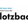
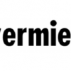
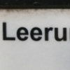
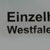
random photos with same
- category
- font
- designer
- foundry
- year
- category
- font
- designer
- foundry
- year