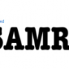
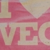
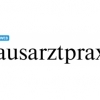
Zine Slab
| details about the font | |
|---|---|
| Name | Zine Slab [wrong?] |
| Style | Roman [wrong?] |
| category | Serifenbetonte Linear-Antiqua [wrong?] |
| designer(s) | Ole Schäfer [wrong?] |
| foundry | FontFont [wrong?] |
| date released | 2001 [wrong?] |
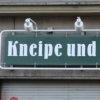
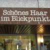
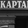
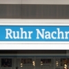
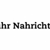
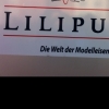
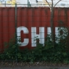
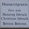
| details about the photo | |
| author | Yvonne |
| date | January 20, 2012 – 10:31 |
| place | Kampstraße 90, 44137 Dortmund, Deutschland |
more information about the font
Basis for Zine was a headline font made for a German newspaper (Sächsische Zeitung) in 1996/97, but it was only a starting point. Ole Schäfer completely re-drew the face, adjusting letter forms and adding weights. He also addressed something that has long been a problem in newspaper and magazine design, that of finding sans and serif faces that work together as headline fonts. His solution was to draw them all right from the start: serif, sans serif and slab serif, effectively covering the entire spectrum. This breadth of choice means Zine can be used in just about any environment, from traditional right through to the very modern. As display fonts, these Zines are best suited to headlines, sublines, titles, photo credits, etc., but set a little looser they are fine for text as well.
random photos with same
- category
- font
- designer
- foundry
- year
- category
- font
- designer
- foundry
- year