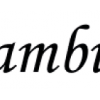
Croissant
| details about the font | |
|---|---|
| Name | Croissant [wrong?] |
| Style | Regular [wrong?] |
| category | Schreibschriften [wrong?] |
| designer(s) | Philip Kelly [wrong?] |
| foundry | Linotype Design Studio [wrong?] |
| date released | 1978 [wrong?] |
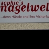
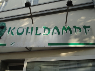
| details about the photo | |
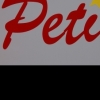
| author | magda |
| date | February 01, 2012 – 15:36 |
| place | Oesterholzstraße 53, 44145 Dortmund, Deutschland |
more information about the font
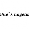
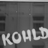
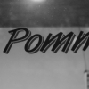
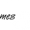
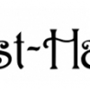
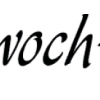
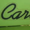
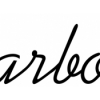
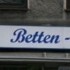
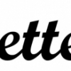
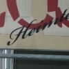
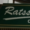
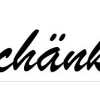
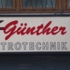
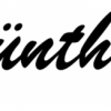
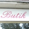
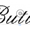
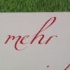
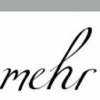
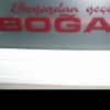
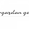
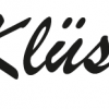
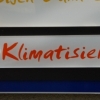
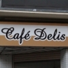
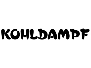
Phillip Kelly first drew the Croissant typeface in 1978 for Letraset. Back in the 1970s and 80s, Letraset's rubdown lettersheets were a popular means of designing with type. Today, many of these nostalgic classics are available in digital format. Linotype is pleased to re-present Croissant. This experimental typeface is built up out of round, brush-like strokes, creating heavy, and black letters. These forms are best used for display signage and headline text. If you are designing for a local bakery or donut shop, this typeface may be the perfect fit.
The dark, heavy character that Croissant lends to the page is similar to Cooper Black , one of the most renowned American type designs ever produced. If you are looking for a typeface with Croissant's feel, but need to set smaller headlines or text, check out that family's offerings.
random photos with same
- category
- font
- designer
- foundry
- year
- category
- font
- designer
- foundry
- year