Twentieth Century

| details about the font | |
|---|---|
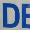
| Name | Twentieth Century [wrong?] |
| Style | Ultra Bold [wrong?] |
| category | Serifenlose Linear-Antiqua [wrong?] |
| designer(s) | Sol Hess [wrong?] |
| foundry | Monotype Imaging [wrong?] |
| date released | 1941 [wrong?] |
| details about the photo | |
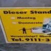
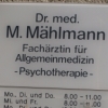
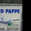
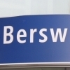
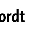
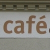
| author | Nasibov |
| date | January 31, 2012 – 23:46 |
| place | An der Palmweide 55, 44227 Dortmund, Deutschland |
more information about the font
Classification: Sans Serif , ESQ® (Enhanced Screen Quality) ,
Geometric Sans , OpenType Pro
Displayed Version: Mac & Win OpenType - PostScript Flavor (.otf)
Font Kategorie: IV - Serifenlose Linear-Antiqua
Fonts.com: http://www.fonts.com/findfonts/detail.htm?productid=174988
Price: $29
Weitere Infos:
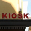
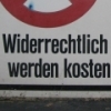
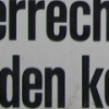
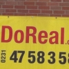
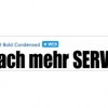
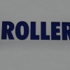
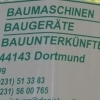
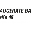
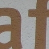
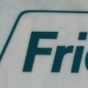
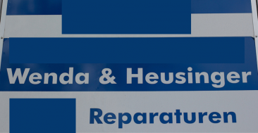
Twentieth Century is a geometric sans-serif foundry typeface designed by Sol Hess
for Lanston Monotype as a competitor to the successful Futura typeface, but with
a larger x-height and more even stroke width. The Twentieth Century face is distinct
for its single-story lowercase a and g.
The various weights and widths were cut over a period of ten years:
Twentieth Century (1937)
Twentieth Century Bold Italic (1937)
Twentieth Century Extrabold Italic (1937)
Twentieth Century Extrabold Condensed Italic (1938)
Twentieth Century Ultrabold (1941)
Twentieth Century Ultrabold Condensed (1944)
Twentieth Century Medium Condensed Italic (1947)
Twentieth Century Ultrabold Italic (1947)
random photos with same
- category
- font
- designer
- foundry
- year
- category
- font
- designer
- foundry
- year