FF Dax-Medium

| details about the font | |
|---|---|
| Name | FF Dax-Medium [wrong?] |
| Style | Medium [wrong?] |
| category | Serifenlose Linear-Antiqua [wrong?] |
| designer(s) | Hans Reichel [wrong?] |
| foundry | FontFont.com [wrong?] |
| date released | 1995 [wrong?] |
| details about the photo | |
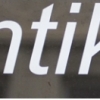
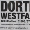
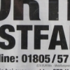
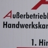
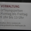
| author | Nasibov |
| date | January 31, 2012 – 23:39 |
| place | An der Palmweide 55, 44227 Dortmund, Deutschland |
more information about the font
Displayed Version: Windows/Mac TTF
Font Kategorie: IV - Serifenlose Linear-Antiqua
URL: http://new.myfonts.com/fonts/fontfont/ff-dax/medium/
URL: https://www.fontfont.com/fonts/dax/medium
Price: -
Format: OpenType TTF
Version: -
File size: -
Weitere Infos:
Hans Reichel’s first design to be published by FSI was ff Dax Condensed (1995) which developed from
the idea of combining the clarity of a narrow Futura with a “slightly roman touch” to make a
space-saving but very legible typeface of timeless design.
Very characteristic for the typeface are the missing spurs in the d, g, m, n, p, q, r and u. The family
quickly grew to include the wider, but still narrow, ff Dax, followed by ff Dax Wide, less space-saving
than its predecessors but still on the slender side. And, in keeping with tradition, available in six weights:
Light, Regular, Medium, Bold, Extra Bold and Black.
Dax Compact is a useful extension of the ff Dax family. The main difference in comparison to the regular
version is that ascenders and descenders are relatively small and the upper case letters have the same
height as the lower case letters with ascenders. That makes the typeface appearing larger and more
compact although set in the same point size. The width is somewhere between ff Dax Condensed and
ff Schmalhans. The ff Dax Compact is especially suitable for headlines in magazines, newspapers, for
posters, flyers ... whenever a little more noise is needed.
random photos with same
- category
- font
- designer
- foundry
- year
- category
- font
- designer
- foundry
- year