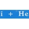
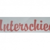
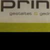
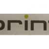
Triplex

| details about the font | |
|---|---|
| Name | Triplex [wrong?] |
| Style | Regular [wrong?] |
| category | Antiqua-Varianten [wrong?] |
| designer(s) | Zuzana Licko [wrong?] |
| foundry | Emigre [wrong?] |
| date released | 1985 [wrong?] |
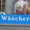
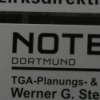
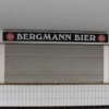
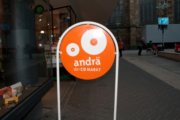
| details about the photo | |
| author | Yvonne |
| date | January 20, 2012 – 11:09 |
| place | Schwarze-Brüder-Straße 3, 44137 Dortmund, Deutschland |
more information about the font
Although initially designed as a rational/geometric font, Triplex developed into one of Licko's most intuitive typeface designs at the time. It's first extensive use was in Emigre magazine #14, a special issue devoted to Swiss designers.
Triplex was intended as a friendly substitute for Helvetica. The name Triplex refers to the three versions that make up the entire family; Triplex, Triplex Serif and Triplex Italic. Each version of the typeface comes in light, bold and extra bold. The italic was designed and drawn by type designer and sign painter John Downer, and was designed to work with both the serif and sans serif versions.
random photos with same
- category
- font
- designer
- foundry
- year
- category
- font
- designer
- foundry
- year