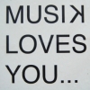
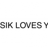
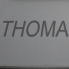
Metro Office
| details about the font | |
|---|---|
| Name | Metro Office [wrong?] |
| Style | Regular [wrong?] |
| category | Serifenlose Linear-Antiqua [wrong?] |
| designer(s) | William Addison Dwiggins, Akira Kobayashi [wrong?] |
| foundry | Linotype Design Studio [wrong?] |
| date released | 2006 [wrong?] |
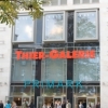
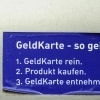
| details about the photo | |
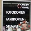
| author | HKS |
| date | January 18, 2012 – 18:12 |
| place | Poststraße 8, 44137 Dortmund, Deutschland |
more information about the font
The Metro Office family is designed after the model of the original sans serif family produced by W.A. Dwiggins and Mergenthaler Linotypeís design studio during the late 1920s and 1930s. A distinctly new interpretation of the sans serif idea, Metro was a thoroughly ìAmericanî sans serif when it was released. However, over the ensuing decades, it became a favorite the world over. Moreover, it is one of the first ìhumanistî sans serif typefaces designed.
While redesigning Metro in 2006, Linotypeís Type Director Akira Kobayashi drew from his own knowledge of humanistic letterforms. The result is a redefined Metro; a typeface that is finally ready for heavy text setting.
The original Linotype Metro never had italic variants. Kobayashi has created oblique variants, extending its use in document setting.
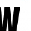
A double-storey a and g, as well as a wider w were features of Dwigginsí original Metro design that were filtered out by Mergenthaler Linotype in the 1930s. Kobayashi remedied this historical slight, retooling Dwigginsí original forms and optimizing their legibility.
Kobayashi has additionally retooled some of Metroís more troublesome letters, which has black elements that became too dense. By opening up the troublesome joins (like that on the Q), Kobayashi has given his new Metro a more even color in text, improving its legibility while retaining its original spirit.
random photos with same
- category
- font
- designer
- foundry
- year
- category
- font
- designer
- foundry
- year