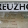
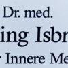
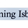
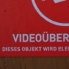
Standard CastleType/CT
| details about the font | |
|---|---|
| Name | Standard CastleType/CT [wrong?] |
| Style | Bold Condensed [wrong?] |
| category | Serifenlose Linear-Antiqua [wrong?] |
| designer(s) | Jason Castle [wrong?] |
| foundry | Castle Type [wrong?] |
| date released | 1991 [wrong?] |
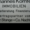
| details about the photo | |
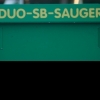
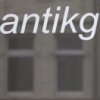
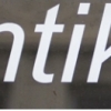
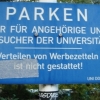
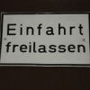
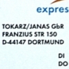
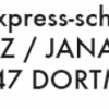
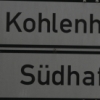
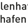
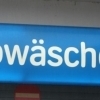
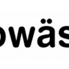
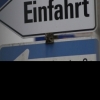
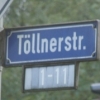
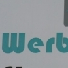
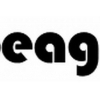
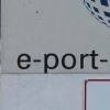
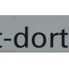
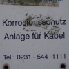
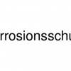
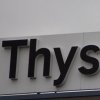
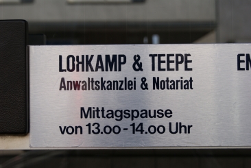
| author | Sascha K |
| date | January 17, 2012 – 17:42 |
| place | Gerichtsstraße 9, 44137 Dortmund, Deutschland |
more information about the font
CastleType was commissioned in 1991 by San Francisco Focus magazine to digitize three members of the Standard
family. This is a Continental lineale that was popular in Switzerland in the 1950s and later in the United States. A cousin to the
ubiquitous Helvetica and very similar to Akzidenz-Grotesk, Standard is an alternative that is considerably warmer and a bit more
idiosyncratic.
In 2008, CastleType released additional members of the Standard CT family to make it a complete typographic solution with three
widths (normal, condensed, extended) of four weights each (Regular, Medium, Bold, and Extra Bold). Some of the original Standard
fonts, particularly Standard Regular, appear to have been hastily designed (or perhaps too closely imitated Helvetica); these
have been greatly improved in the CastleType versions with more harmonious proportions and other refinements. The three lighter
weights of the Extended subfamily were designed from scratch based on the new Standard CT Regular and Standard CT Extended
Extra Bold. More recently, four light weights (Light, Extra Light, Ultra Light, and Hairline) have been added to each of the three
widths.
The entire Standard CT family includes support for most European languages, OpenType features, arbitrary fractions, and a collection
of geometrics, dingbats & fleurons.
random photos with same
- category
- font
- designer
- foundry
- year
- category
- font
- designer
- foundry
- year