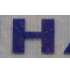
Scion


| details about the font | |
|---|---|
| Name | Scion [wrong?] |
| Style | 650R Bold [wrong?] |
| category | Serifenlose Linear-Antiqua [wrong?] |
| designer(s) | Alex Kaczun [wrong?] |
| foundry | Type Innowation [wrong?] |
| date released | 2011 [wrong?] |
| details about the photo | |
| author | bolsheep |
| date | January 30, 2012 – 21:45 |
| place | Freistuhl 7, 44137 Dortmund, Deutschland |
more information about the font
http://new.myfonts.com/fonts/typeinnovations/scion/
About this font family
‘Scion’ is an original design by Alex Kaczun. The inspiration for the typeface came from the Toyota SCION logo, which bears its name.
In Alex’s own words, „I loved the simplicity, proportions and hi-tech look of the logo and decided to create an entire new design series based on its unique look“.
The fonts come in five flavors: thin, light, regular, bold and black. All the font weights were designed systematically on tabular widths so that the user can make adjustments to overall type color without changing the line length.
In addition, Alex Kaczun has provided us with several alternate glyph substitions to further enhance the overall appeal of this contemporary new design.
The large Pro font character set, which supports most Central European and many Eastern European languages, makes this typeface series ideally suited for
display copy as well as text composition. In the near future, Alex plans to include a narrow, compressed and ultra expanded, along with true-drawn italic variations to further expand the possibilities of this great new display series.
http://www.fontspring.com/fonts/type-innovations/scion
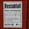
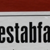
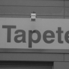
random photos with same
- category
- font
- designer
- foundry
- year
- category
- font
- designer
- foundry
- year