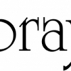
Beaufort

| details about the font | |
|---|---|
| Name | Beaufort [wrong?] |
| Style | Bold [wrong?] |
| category | Antiqua-Varianten [wrong?] |
| designer(s) | Nick Shinn [wrong?] |
| foundry | Shinn Type [wrong?] |
| date released | 1999 [wrong?] |
| details about the photo | |
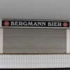
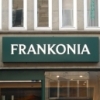
| author | bolsheep |
| date | January 30, 2012 – 11:49 |
| place | Hansastraße 7, 44137 Dortmund, Deutschland |
more information about the font
http://new.myfonts.com/fonts/shinn/beaufort/
This type is almost a sans serif. It has legibility proportions, and a very large, useful family with specially adapted condensed and extended sub-families.
Compared with type set by older technologies, PostScript type, imageset and printed by high-resolution offset lithography, has a remarkable clarity — at any size.
While many types, old and new, benefit from this level of definition, few designs specifically exploit it. Beaufort does.
Its pointed serifs introduce a sharpness of reproduction that was difficult to achieve, at any size, prior to PostScript.
This means that small sizes of Beaufort will combine a high word count with good legibility, while large sizes will always display very fine detail. Optical scaling is not required.
In style, Beaufort has a number of affinities. In particular, the bold romans recall a kind of “grotesque with small serifs” style popular
with sign painters and package lettering artists in the early 20th century, and still going strong. In proportion, the basic Beaufort is
in the vein of the classic oldstyle types that descend from Granjon, via the French Oldstyles, or Elzevirs, to Plantin and Times in the early twentieth century.
Designed for optimum clarity, readibility, and word count, these types have a pronounced angle of stress in the lower case, which is quite large and fairly narrow in relation to the caps.
None of the caps are exceptionally narrow, and both cases have an evenness of width that makes for a no-nonsense, orthodox appearance.
The strength of the capitals distinguishes these types from those of another “optimizing” era, the 1970s and ’80s, when puny caps made for monotonous text.
However, strong though they may be, Beaufort’s caps are not as obtrusive in text as those of Times or Plantin.
http://new.myfonts.com/fonts/shinn/beaufort/bold/
random photos with same
- category
- font
- designer
- foundry
- year
- category
- font
- designer
- foundry
- year