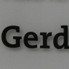
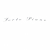
coolvetica

| details about the font | |
|---|---|
| Name | coolvetica [wrong?] |
| Style | Regular [wrong?] |
| category | Venezianische Renaissance-Antiqua [wrong?] |
| designer(s) | Ray Larabie [wrong?] |
| foundry | Larabie [wrong?] |
| date released | 1999 [wrong?] |
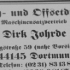
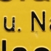
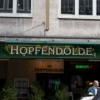
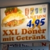
| details about the photo | |
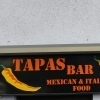
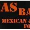
| author | cndrk |
| date | January 25, 2012 – 01:56 |
| place | Oesterholzstraße 67, 44145 Dortmund, Deutschland |
more information about the font
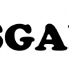
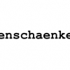
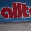
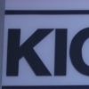
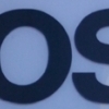
Coolvetica is a scratch built, sans serif font, based on an American chain store logo circa 1970. It was an era when everyone was modifying Helvetica, and not just for logo designs. Even font designers were at it.
The Photo Lettering Inc. catalog was loaded with playful helvariations.
Even Letraset chimed in with Shatter, Formula One & Isometric.
Coolvetica recreates that 1970s custom display lettering look with really tight kerning and funky curls. The tails on the R and a have been left out to allow even tighter spacing. This is not a text font. Coolvetica is a pure display font, intended for big, funky headings and titles. The 1999 version of Coolvetica had a G with a swash tail. The current version still contains a swash G, but it’s accessed as a “stylistic alternate” in OpenType savvy applications. Coolvetica has class based kerning, math symbols, fractions and numeric ordinals.
Coolvetica Regular is free for commercial use.
random photos with same
- category
- font
- designer
- foundry
- year
- category
- font
- designer
- foundry
- year