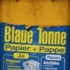
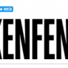
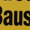
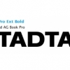
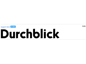
Kaapeli
| details about the font | |
|---|---|
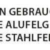
| Name | Kaapeli [wrong?] |
| Style | Bold [wrong?] |
| category | Serifenlose Linear-Antiqua [wrong?] |
| designer(s) | Tomi Haaparanta [wrong?] |
| foundry | Suomi Type Foundry [wrong?] |
| date released | 2009 [wrong?] |
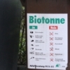
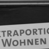
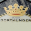
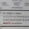
| details about the photo | |
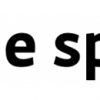
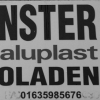
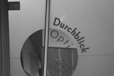
| author | cndrk |
| date | January 25, 2012 – 01:00 |
| place | Borsigplatz 4, 44145 Dortmund, Deutschland |
more information about the font
It is a brilliant headline font with a lot of character, but it is the characters I have problems with. The versions of all big foundries have the same flaws (in my opinion), especially lowecase a and s.
So I finally went ahead and made an all new version. It is not Kabel, but very much like it. It has unique x-height, weight and width, and many individual characters are also different from the original.
random photos with same
- category
- font
- designer
- foundry
- year
- category
- font
- designer
- foundry
- year